Structural inequalities in primary care – the facts and figures

The factors determining the quality and quantity of primary care services vary across England. Here we analyse practice level data relating to the supply, demand, and need for primary care, according to the socioeconomic status of the patients served.
Which ICBs have the greatest need for primary care?
Different populations have different needs for primary care. The NHS measures health care need by accounting for the populations’ demographic characteristics and overall health status to produce a ‘weighted’ population count (1).
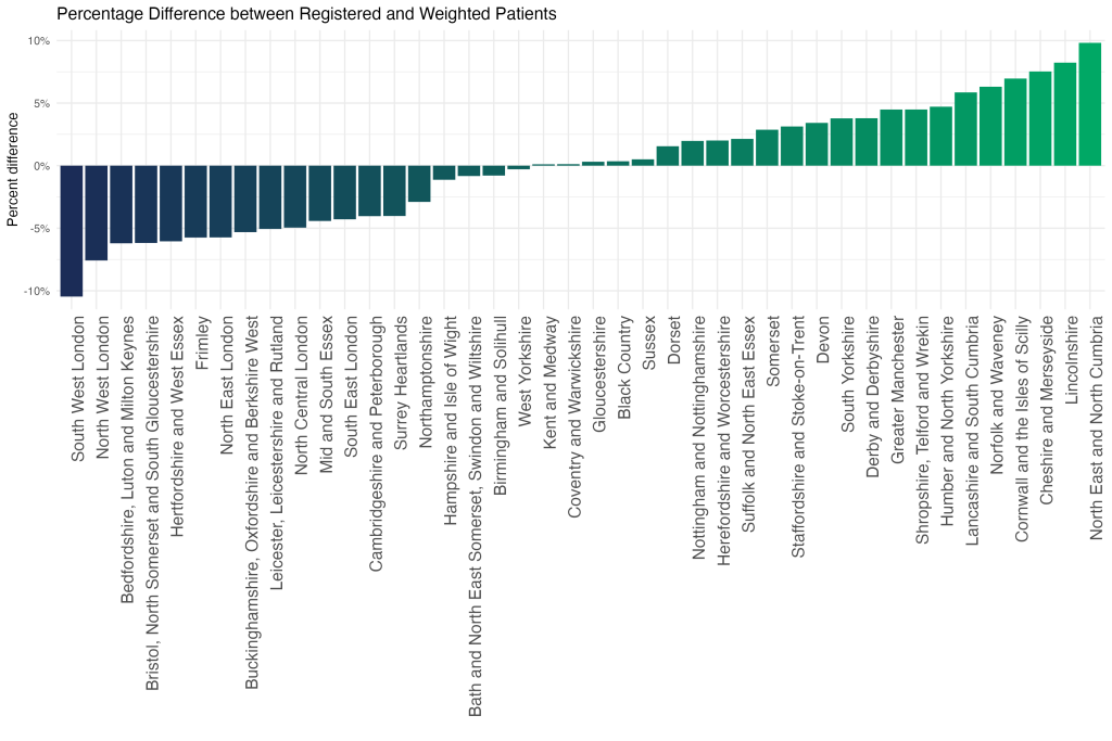
This chart demonstrates that the ICBs with the greatest healthcare need relative to population size are North East and North Cumbria, Lincolnshire, and Cheshire and Merseyside.
This pattern reflects a combination of demographics, such as the number of older people, socioeconomic disadvantage (such as the level of poverty) and the health of the population.
Which ICBs have the highest concentration of GP surgeries serving predominantly socioeconomically disadvantaged patients?
The NHS has developed an approach – Core20PLUS5 – to target the most socioeconomically disadvantaged 20% of the national population, as identified by the Index of Multiple Deprivation (IMD). Levels of deprivation vary between ICBs; to understand the distribution of GP surgeries across the socioeconomic gradient, we have divided practices into quintiles from most to least deprived, based on the deprivation score (IMD 2019) of the populations served (2).
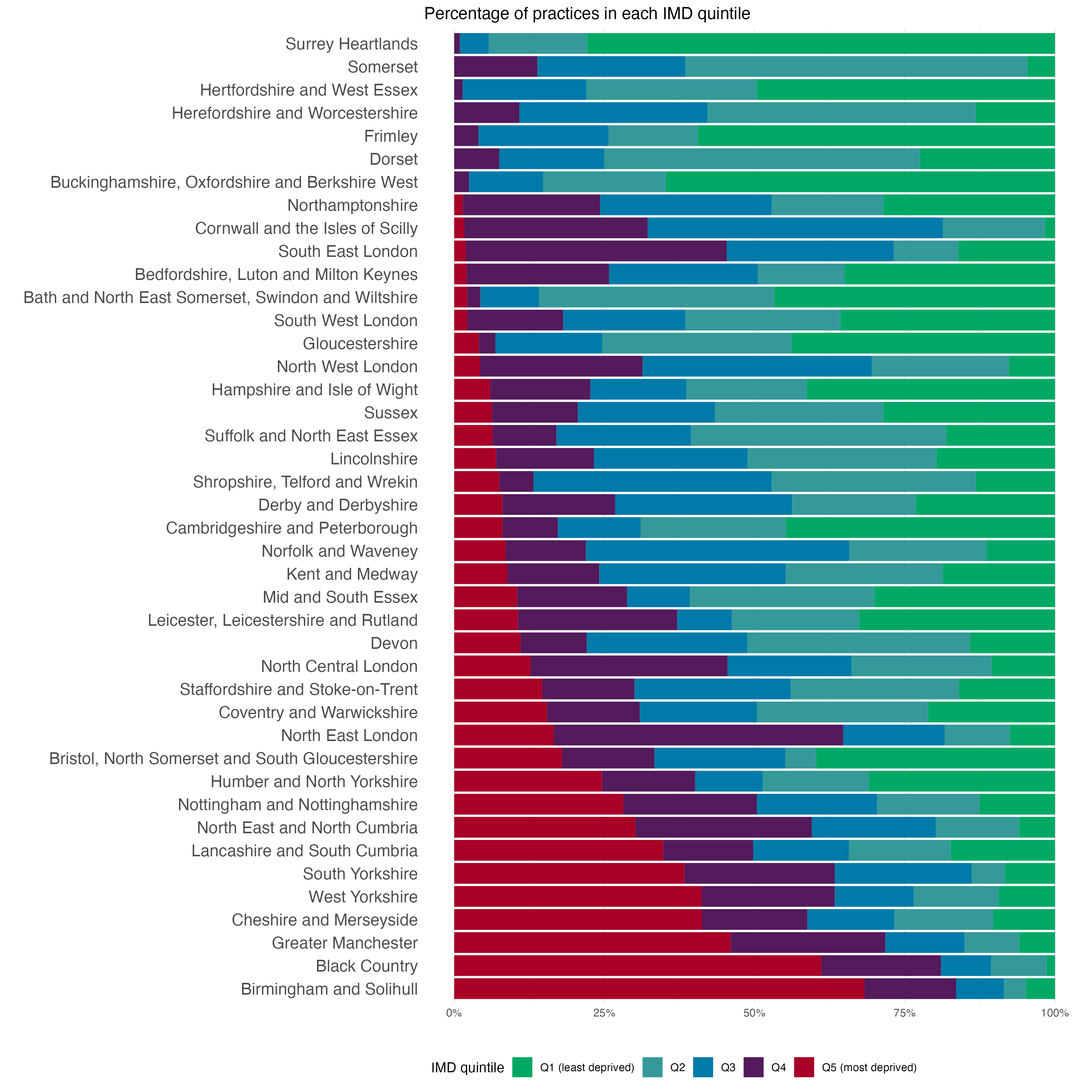
This chart illustrates that over 60% of practices in Birmingham & Solihull and the Black Country serve populations that are predominantly in the most deprived quintile of the national population, whereas there are no practices in the Surrey Heartlands or Somerset which are in the lowest deprivation quintile based on an average of the population they serve.
This does not mean that there are not pockets of poverty and disadvantage in Surrey Heartlands or Somerset, rather when all the patients in each practice are combined the average is not in the lowest quintile.
How does the prevalence of medical conditions vary across socioeconomic groups?
The following data explorer illustrates the prevalence of medical conditions over time across different socioeconomic groups, as measured by the Quality and Outcomes Framework (QOF) and the IMD (3). To determine the prevalence, the total number of patients registered with each condition in all practices serving each quintile was calculated, and divided by the total number of patients.
We see that for 9 out of the 22 conditions recorded, prevalence is actually lower in practices serving the most deprived quintile than in those serving the least deprived. This result could be due to the fact that individuals in the more deprived quintiles tend to be younger, hence have lower risk of certain medical conditions.
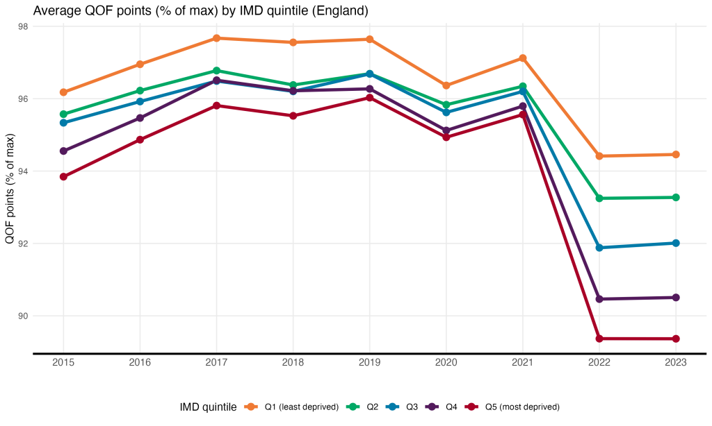
How does achievement of QOF indicators vary across socioeconomic groups?
The following chart shows the average achievement of Quality and Outcomes Framework (QOF) indicators by income deprivation quintile (IMD) in England between 2015 and 2022. We see that on average, practices in the least deprived areas achieved a higher percentage of maximum QOF points than those in the most deprived areas across the period. The was a decline in achievement points across the board in 2021, which saw the disparity between the most and least deprived quintiles increase from 1.5% in 2021 to 5% in 2022.
How does NHS funding to GP surgeries vary across socioeconomic groups?
In order to ensure equitable primary care, practices serving populations with higher health care need should receive commensurately higher funding. Here we plot how funding has changed over time by socioeconomic group across England (4).
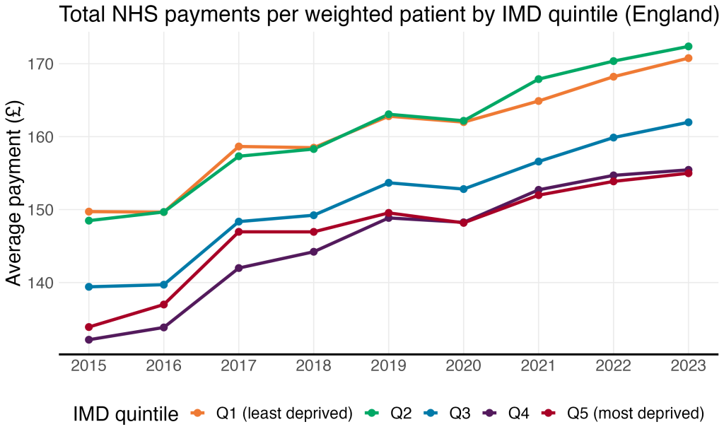
Practices serving the most deprived 20% of the population received £14 less in NHS payments per weighted patient in 2022 than their counterparts serving patients in the top quintile; in 2015, the difference was £16.
What drives the inequalities in NHS funding across socioeconomic groups?
Practices receive income based on their population (capitation payment) and for providing additional services or meeting quality standards. The largest proportion – the Global Sum – is allocated based on the number of patients, as well as their estimated healthcare need.
Even though Global Sum payments are supposed to account for healthcare need, the practices serving the most deprived quintile (Q5) still receive less in terms of payments from the NHS than practices serving the least deprived quintile (Q1). Therefore, Q1 must be receiving relatively more in payments in the other categories.
Here we divide payments in each quintile into several different categories and determine the proportion of total payments of each category in each quintile in 2022.
Total payments by type by IMD quintile, 2023 (England)
In relative terms, prescribing payments constitute 13% of Q1’s payments, versus only 2% of payments to Q5. As such, the socioeconomic gradient in payments is largely driven by differences in prescribing payments. This relationship can be explored by removing dispensing payments from the total by the clicking the yellow circle: the disparity between payments to practices in Q1 and Q5 is reduced when dispensing payments are excluded.
How is the workforce distributed across deprivation quintiles?
The number of staff that each practice employs is important because it impacts on the number of appointments they can offer. Funding, workforce availability, practice culture and neighbourhood factors all contribute to staffing levels within a practice. Here we have mapped the socioeconomic gradient of GPs, nurses and Direct Patient Care staff (DPC, staff who treat patients but are not GPs or nurses) in each ICB.
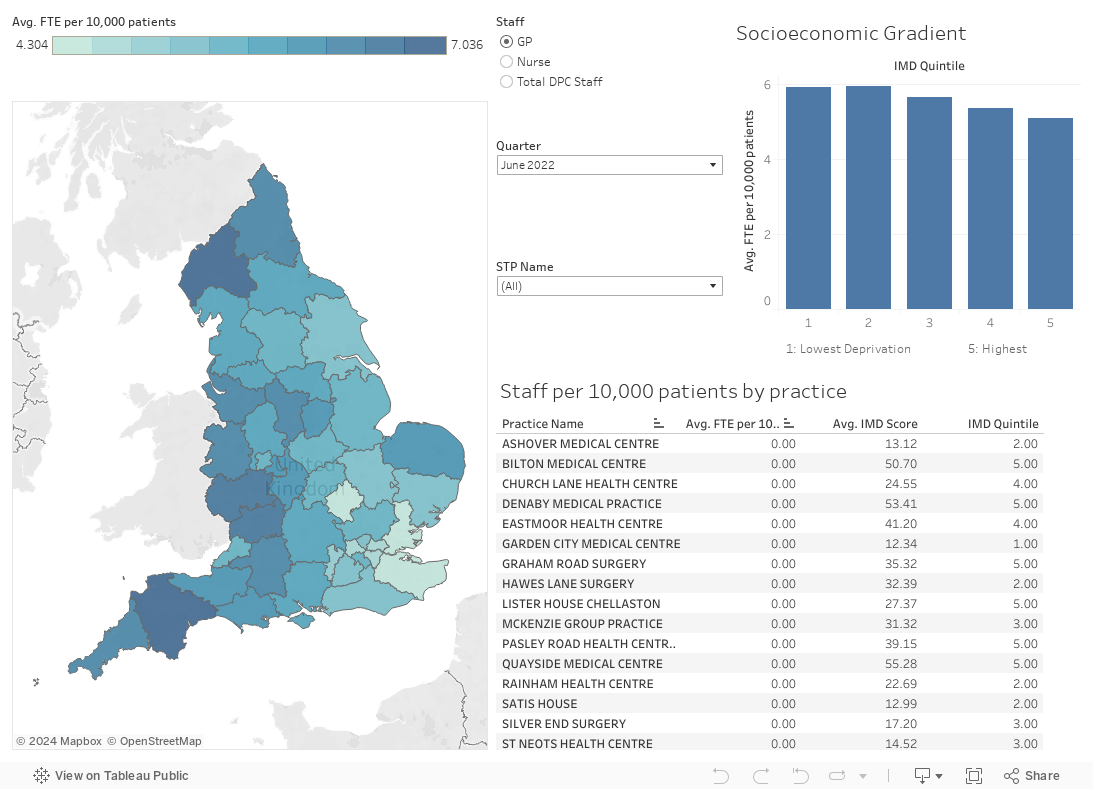
In 2022, practices serving the most deprived 20% of the national population had 4.2 more DPC staff per 100,000 population than the practices serving the top quintile.
Next we plot the number of full time equivalent (FTE) staff per 100,000 population by IMD quintile for each type of staff over time for all of England (5).
We see that the socioeconomic gradient exists for both GP and DPC staff.
What is the impact of inequalities in population need, funding and workforce?
There is a mismatch in supply (funding and workforce) and demand/need (weighted population, deprivation, and diseased prevalence) patterned across the socioeconomic gradient. This mismatch leads to inequalities in patient experience of general practices, as measured by the GP Patient Survey (6).
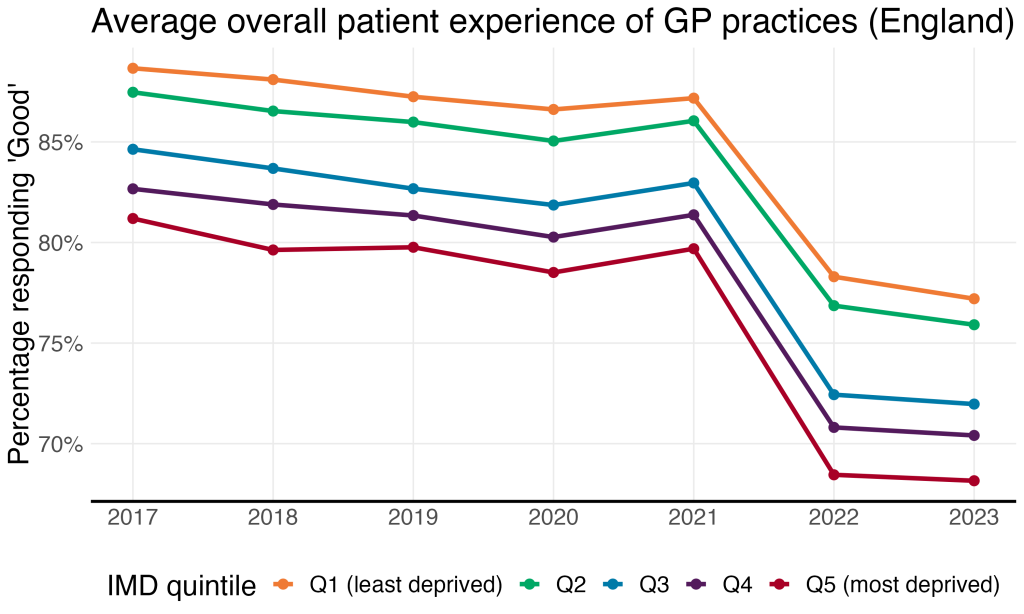
This chart shows how patient satisfaction with GP practices has changed over time by socioeconomic group across England. We see that in 2015, 89% of patients who visited practices serving the least deprived quintile described their overall experience as ‘Good’, versus 81% of patients visiting practices serving the most deprived 20%. This disparity increased following a decline in patient satisfaction across the board in 2022, from 8% to 10%.
Appendix
- The ‘weighted’ population for each ICB is calculated by NHS England to allocate funding according to healthcare need and cost. More information on the ‘weighted capitation formula’ can be found in NHSE’s Technical Guides to Allocation Formulae.
- The deprivation score for each practice was obtained from the Office for Health Improvement & Disparities via Fingtertips’ National General Practice Profiles. Practices are assigned to quintiles based on their IMD relative to all other practices in the country. However, in the workforce Tableau, quintiles are determined based on the practices’ IMD relative to other practices within its ICB.
- NHS Digital, Quality and Outcomes Framework: Prevalence, achievement and personalised care adjustments, respiratory group, GP practice level
- NHS Digital, NHS Payments to General Practice. We exclude COVID and PCN payments, which began in 2021.
- NHS Digital, NHS workforce statistics (September)
- NHS England, GP Patient Survey